
Shweiki Media teams up with Linda Ruth—CEO and president of PSCS Consulting and authority on marketing and audience development—to present magazine publishers a webinar about how newsstands have stayed the same and evolved over the years.
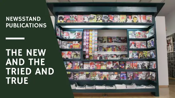
The other day I was looking at my newsstands and thinking about the things that have stayed the same and the things that have changed and evolved over the last couple of years in newsstand publishing.
Constants in Newsstand Publishing
One of the things that has not changed over the last 2o years is the importance of putting the product on the magazine cover. Every special interest publisher needs to have that focus of their special interest on the cover of every issue of their magazine whether its gardens, guitars, houses, boats, etc. That special interest must be on the cover for almost every issue because it will inspire audience to buy.
Another thing that has not changed is the effectiveness of new or topical covers. Both Guitar World and Weekly Standard are able to pull together topical items very quickly. Weekly Standard put out “See You, EU?” cover before the Brexit vote was announced. Both of these publications have found the sweet spot between the interest of their readers and the incredible topicality of their topics.
Changes in Newsstand Publishing
Something that has changed for newsstand magazines is background colors. A couple of decades ago, it was widely understood that in order to sell well, the magazine cover had to have a light or white background. This month I found five publications with light or white backgrounds in which two of them are doing fairly worse than average. It looks as if light and white covers are no longer the standard fix they use to be. On the other hand, black covers have become incredibly prolific and widespread throughout the industry. If you walk to any newsstand and you will see a startling amount of covers either dark or black. This approach makes a publication stand out more amongst the light and colorful covers.
Two new publications called Dumbo Feather and B tap into another old tendency which is becoming new again. Print publications have always been important for the special interest community to rally around and use as a way to cohere. Now, the special interest around which many communities are cohering to is the passion and purpose. Dumbo Feather’s tagline is “Passion, Purpose, and Community.” B magazine covers for-profit corporations that aim to do good in the world. Both of them tap into the desire for connectedness and purpose that is greater than it was two decades ago.

This leads us to a third publication which also taps into the purpose and community. A Christian magazine called Live With Heart and Soul is geared toward women. The publisher of this magazine identified what she thought was missing from the market: hope and love. Positive cover headlines have always been an important part of newsstand sales. However, cynicism and controversy is also very important in terms of stirring up interest and generating sales. What Live With Heart and Soul realized is that the balance has gone too far toward cynicism and controversy and needs to be pushed more toward positive and hopeful. This publication also provides a full interactive experience which is unique and is not available to the online audience. Every single publisher has both print and online audiences. What print publishers are aiming to do is provide something they cannot do effectively online.
Savor Life and Enchanted Owls magazines are examples of physical experiences that print publishers can offer. Savor Life is a magazine for women entrepreneurs and it includes guided worksheets that help women achieve goals through implemented strategies and tactics. Enchanted Owls is an adults coloring book which is a category that has been getting a lot of buzz lately. Adult coloring books are definitely an interactive print experience that is not available in other formats.
An Interactive, Physical Experience
The interactive, physical experience also encompasses the physical product itself. This can include how the product actually feels. Print publishers are going toward high quality, premium product. Not only through the use of more color and better paper quality, but also in the actual texture of the covers. Western Horse and Gun switched from a gloss cover to a matte cover. They find that their readership really enjoy that tactile experience. Pages magazine goes one further by having a matte cover that is so textured it is bumpy. Amplify’s cover is so tactile that it almost feels like sandpaper. This plays into the fact that picking up a magazine hits you on your senses in ways that other kinds of media cannot.
The Old Farmers Almanac is simultaneously one of the oldest and newest publications out there. Its cover is very similar to the original cover it used to launch with 225 years ago. And, yet it is new as well. The entire cover has been vectorized and digitized so it works no matter what the format. It works in big, small, print and digital formats. It will not lose its integrity through copying, digitizing, printing or resizing. Similarly, its content has stayed the same and evolved at the same time. The content has evolved to meet the changing needs, interests and tastes of today’s readers. Therefore, it is the same publication that your parents, grandparents, and even great-grandparents have always read and it is also a brand new publication for today’s audience. It is selling more copies than ever before.
If you have any questions or would like to share your thoughts, please go ahead and give me a call at (603) 924-4407. I would love to speak with you all more about this.